Implementing Dynamic Color: Lessons from the Chrome team
Android Developers Blog

Posted by Rebecca Gutteridge, Developer Relations Engineer on Android
Introduction
With the release of Android 12 and Material You, we provided documentation and guidance on dynamic color foundations, how to implement dynamic color in Jetpack Compose and a getting started codelab. But creating a scalable, personalized, and accessible app with dynamic color can feel like a daunting task. We talked to designers and developers on Google Chrome, and they offered to share some tips on how they approached it at scale for their Android app. Here’s what they suggest if you are considering adopting dynamic color in your app.
Where to start
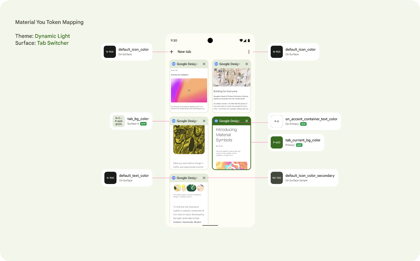
Start by reviewing all your current screens in your app and identify your current colors, themes and surfaces. Chrome kicked off a design review and evaluated their color scheme. Material 3 encourages designers and developers to use color tokens which enable flexibility and consistency across an app by allowing designers to assign an element's color role in a UI, rather than a set value. This is particularly powerful when considering designing for light and dark themes and dynamic color.
Figure 1 : An example surface for Chrome, the Tab Switcher, identifying the color token for each element
Your app may already have a color token system, so reviewing how the new Material You dynamic color enabled color scheme matches your previous naming convention is an important exercise. Engineering should align with UX to review the new color token system with your mocks. This is also a good opportunity to review your current colors.xml, themes.xml and styles.xml.In particular check that your app correctly differentiates between Styles and Themes as well as correctly extending from base themes. It is also worth reviewing if there are redundant colors in your existing scheme or an opportunity to make a more consistent color scheme throughout your app. Dynamic color implementation with Compose is also available.
Accessibility
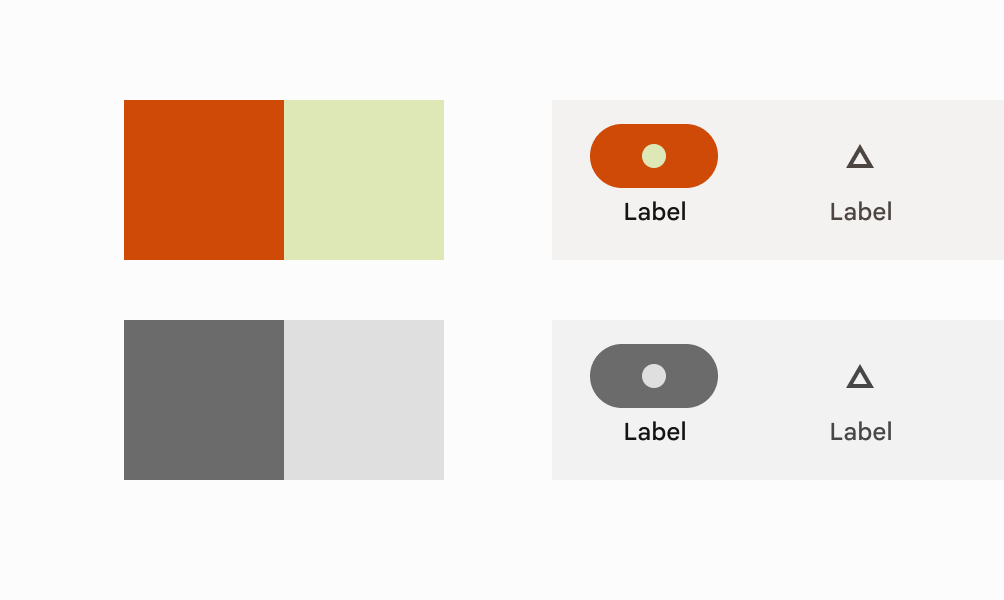
Ensuring your app’s color system is accessible is critical for designing for everyone and creating products that are inclusive to the widest possible audience. Dynamic color is committed to guaranteeing that the color selection model has accessibility requirements built in. Material 3 color schemes are defined by tonality rather than hue or hex value, this system of tonal palettes is central to making any color system accessible by default. Using a minimum 60 luminance spread in color pairings provides enough contrast to ensure accessibility standards.
Figure 2 : Combining color based on tonality, rather than hex value or hue, is one of the key systems that make any color output accessible.
Phase approach
When looking at implementation, consider this upgrade as a phased approach if needed, targeting the primary surfaces first and leveraging that dynamic color can be applied at a per activity level. This was how Chrome was able to update their app and used it as an opportunity to migrate some of their older UI app compat components to the modern Material 3 components, such as Top app bar.
How to support custom colors
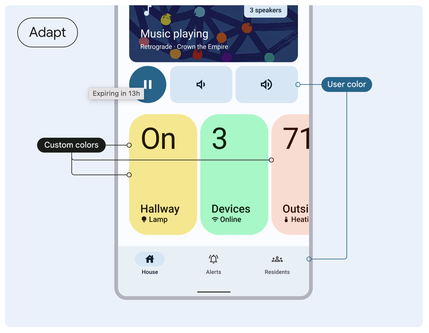
Your app may have custom colors or brand colors that you do not want to change with the user’s preference. These can simply be added additionally as you are building out your color scheme. Alternatively you can import additional colors to extend your color scheme using the Material Theme Builder to create a unified color system. The theme builder includes a color harmonization feature that shifts the tone of a custom color to ensure that visual balance and accessible contrast is achieved when combined with user-generated colors.
Figure 3: Understand how to harmonize custom colors with the Material guidance.
For Chrome, here is a deep dive into two examples of where protected colors are important for them and how they approached it.
Publisher colors
It is important that Chrome allows for brands to keep their known colors and not impact that functionality when adopting dynamic color.
Publishers have the ability to set a publisher color using a metadata element in their html. The top toolbar is controlled using a decision tree to programmatically determine the toolbar color and icon color based on a series of cascading rules:
- Incognito mode has the highest priority. If Incognito is enabled, the toolbar and icon colors follow the dark baseline palette.
- For night theme, toolbar and icon colors follow the dark dynamic theme rather than the publisher color to ensure a consistently dark UI.
- For day theme, the toolbar color is set to the publisher color, the icon color is either white or gray based on whether the publisher color is a dark or light color via util method.
- If the publisher color is too bright or not specified, Chrome defaults to the light dynamic theme.
Incognito
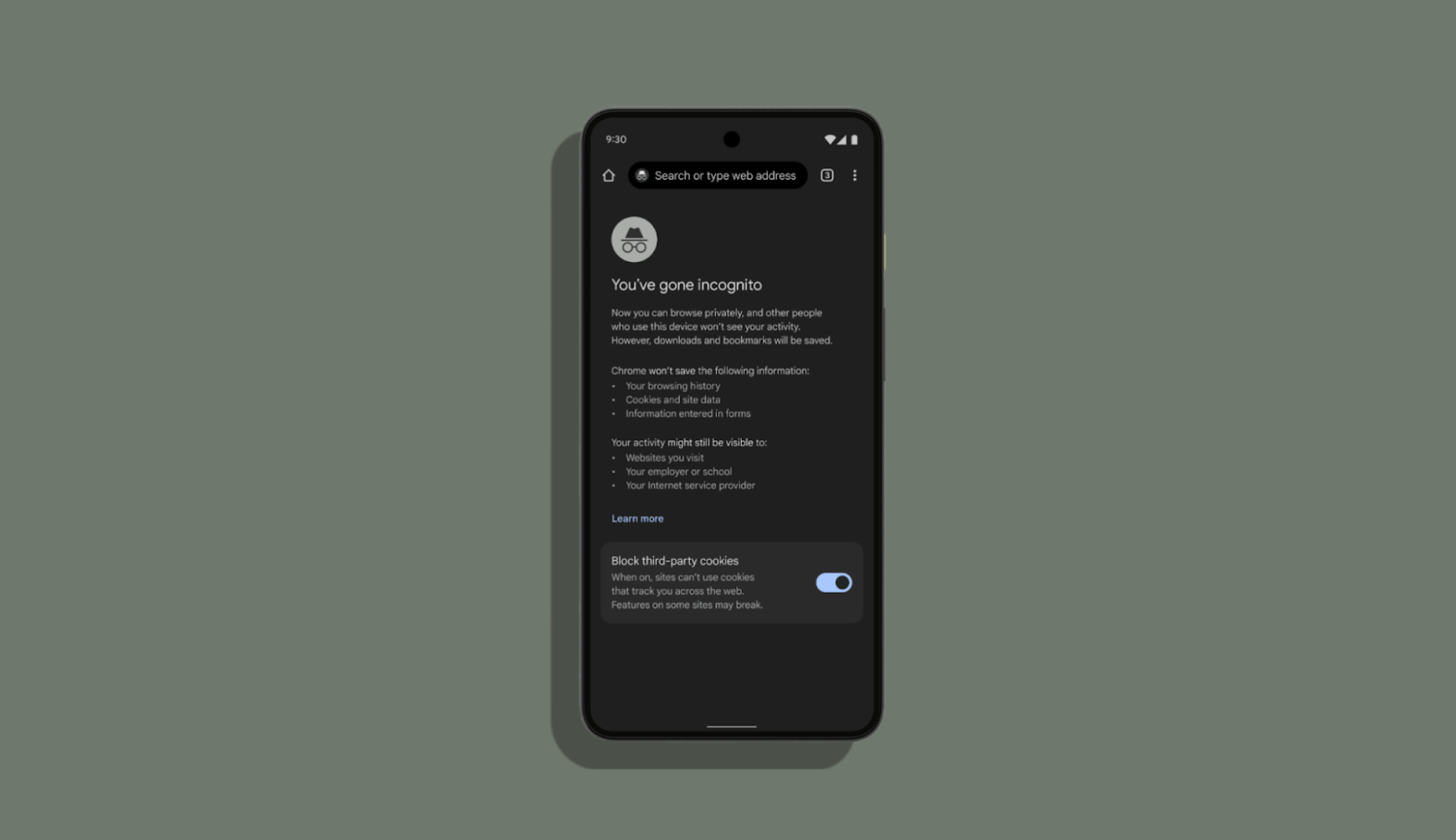
In Incognito mode, the dark gray color scheme has a semantic importance and reassurance for users. Chrome decided to preserve and leverage their existing color system and not change it dynamically.
Figure 4: Incognito mode remains the same
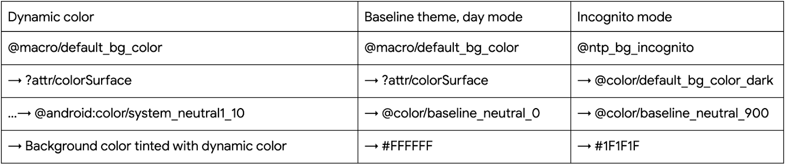
To achieve this, Chrome defined non adaptive colors that map to hex values and adaptive colors that map to different non adaptive colors for day/night mode. For incognito mode, Chrome uses the dark non adaptive colors as they are easily recognized by the users as incognito. With these adaptive colors, Chrome created a baseline theme.
The table below shows what their background colors look like after applying dynamic colors:
Themes and Theme Overlays
One thing to consider for adhering to theme best practices, is to leverage Theme Overlays properly. The Chrome team used this opportunity to refactor their themes and leveraged the power of Theme Overlays for a given activity. At times Chrome saw that full themes were being used where a ThemeOverlay would be more appropriate. Dynamic color and Material3 encourages better code hygiene.
Take a look at this example, previously the theme for full screen dialogs inherited from a full theme. This overrode all the attributes from the activity theme, undoing the dynamic colors or any overrides that are applied at the activity level. With the dynamic color work, the team became more deliberate in how they define and use their theming.
Previously:
    <style name="Base.Theme.Chromium.Fullscreen" parent="Theme.BrowserUI.DayNight">
    <item name="windowActionBar">true</item>
          <item name="colorPrimary">...</item>
          <item name="colorAccent">...</item>
    </style>
Now:
    <style name="Base.ThemeOverlay.BrowserUI.Fullscreen" parent="">
    <item name="android:windowContentTransitions">false</item>
    </style>
Recommendations from Google Chrome designers
This section shares some key lessons that Chrome’s designers applied to successfully create an intentional and unified theme
- Create a unified design system: Material 3 and dynamic color gives the opportunity to reconcile your app’s themes. For Chrome that meant reconciling their light and dark theme and removing fragmentation based on elevation.
- Identifying how to migrate existing color system: Understand the role of your current color system and tokens, if applicable, and how they map onto the M3 color tokens.
- Use accent colors meaningfully: Material 3’s accented color tokens are incredibly powerful and useful, iterate on how best to use them.
- Phased approach: Focus on a few surfaces first. Dynamic color is increasingly part of the user’s expectation of their device, so work out which surfaces make sense to adopt first and then iterate and expand to more surfaces.
- Work closely with your engineers from the beginning: Share designs as soon as you have them with your engineers. Chrome designers asked questions to understand how Chrome was built so they could establish how color would be applied and which components might be affected. This will help you make better informed decisions on which surfaces/components are updated since there could be many dependencies in your app.
- Create custom tokens: If you need to use dynamic colors that are not part of the out of the box color system, create a custom color token that extends your color theme.
Recommendations from Google Chrome developers
This section shares some key lessons that Chrome’s developers applied to successfully migrate
- Have a rigorous theme code hygiene: Create a baseline set of colors without dynamic for instances where dynamic color is not applied, eg, incognito mode and then extend with theme and theme overlays.
- Understand how to use surface colors: Surfaces are treated with “elevation” to allow differentiation from the background and layered elements like app bars, and other navigation elements; this may be a paradigm shift for some apps. Surface colors are calculated at runtime, so there is no resource/color/macro to retrieve them currently. Chrome decided to create a utility method to calculate surface colors using `ElevationOverlayProvider`. However, this is only available to use programmatically while we also needed to implement dynamic color for many layouts in bulk. For this purpose, they created a custom Drawable that can draw a surface color based on a provided elevation value. One drawback of this approach is that a legacy pre-dynamic colors version of each drawable must be maintained for compatibility with old Android versions.
- Importance of using Activity context: It’s important to use the Activity context to inflate views as the Activity has the theme with the dynamic color overlay applied.
- Choice of method to get colors: Usage of ‘Resources#getColor(int)’ was very common in Chrome’s codebase because they needed to support older Android versions. However, to support dynamic color, the `#getColor` method should be able to resolve the color resources against the theme. So, Chrome migrated the `Resources#getColor` calls to `Context#getColor`.
- Macros: Chrome uses semantic color names to have a unified color system throughout the app. Before the dynamic color adoption, a semantic color would look something like this:
@color/default_text_color_light: Color used for primary text
→ @color/default_text_color_dark/@color/default_text_color_light (adaptive to night mode)
→ @color/modern_grey_900/@color/modern_white
→ #1F1F1F / #FFFFFF
Your app may already have a semantic color system and so migrating adds additional considerations. For Chrome they wanted to preserve their semantic colors. In collaboration with UX, they translated the existing color palette to the Material color roles/attributes. Their first idea was to point to these attributes from the existing semantic colors. For example,
@color/default_text_color from the example above would look like this:<color name="default_text_color">?attr/colorOnSurface</color>. However, the@colorresource cannot point to an ?attr. The next idea was to convert all semantic `@color`s to `?attr`s with the same names. This approach also caused issues as they needed to add all the attributes to their themes and there are many activities, themes and entry points to Chrome, so it would be challenging to maintain. Finally, they adopted the newly introduced<macro>tag. Macros are much like C/C++ macros but for Android resources: they are replaced with whatever they point to at build time. So semantic colors became semantic macros, for example,<macro name="default_text_color">?attr/colorOnSurface</macro>. This made it possible to implement dynamic colors at bulk. One limitation of macros is that they cannot be accessed programmatically, but Chrome added static utility methods to work around this. The macro tag is now available in Android Studio Canary.
Dynamic color is coming to more Android 12 phones globally, including devices by Samsung, OnePlus, Oppo, Vivo, realme, Xiaomi, Tecno, and more! As you work with dynamic color in your app, we’d love to get your feedback via the Material Android issue tracker. Happy coloring!